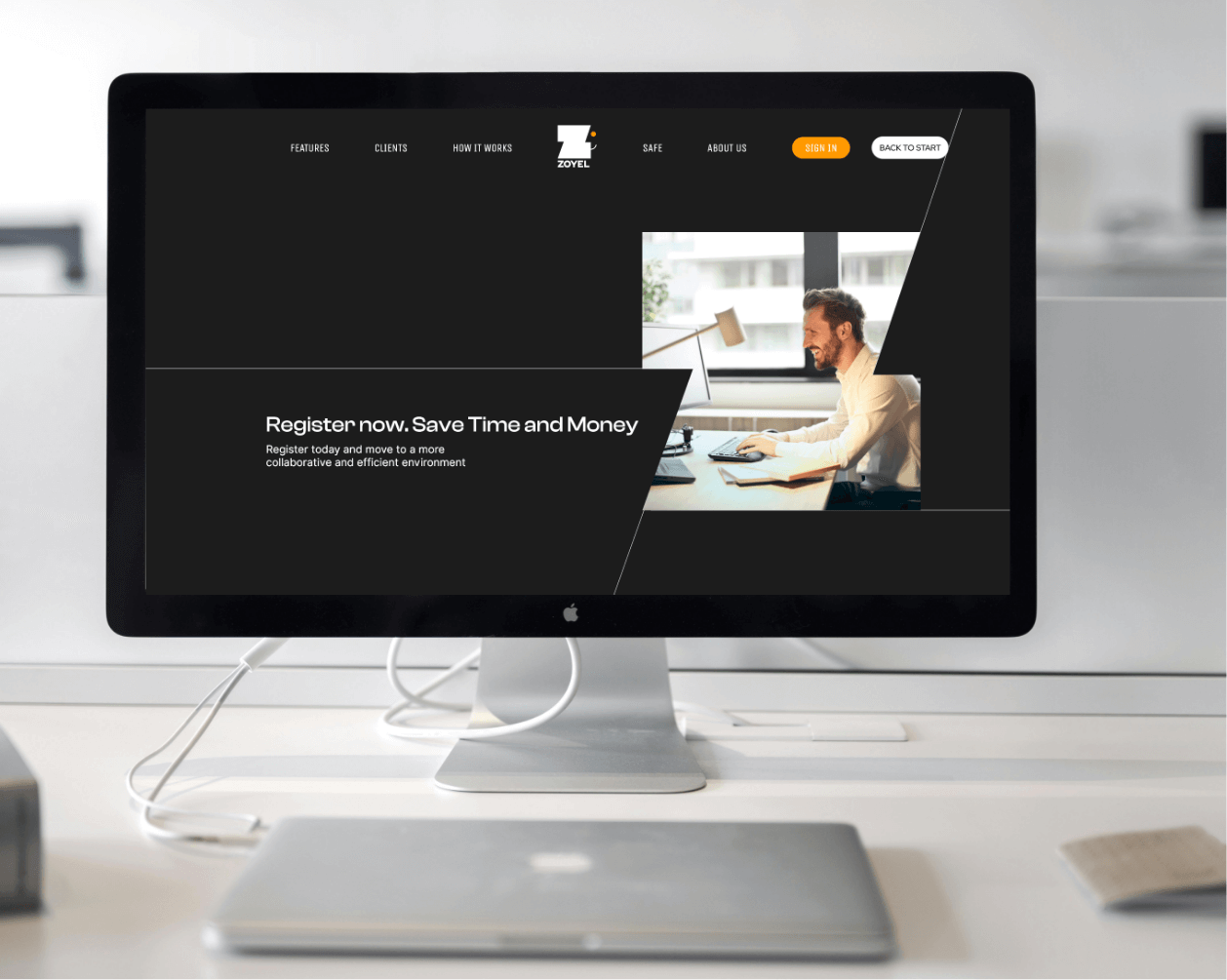
The challenge was clear: incorporate the letter "Z" into the logo while ensuring it would stand out in a sea of logos already using this letter.
Given the prevalence of logos featuring the letter "Z," I knew that creating something distinct would be a tough challenge. I explored multiple options, balancing uniqueness with simplicity. My goal was to craft a design that not only highlighted the letter but also represented the core values of the platform: reliability, innovation, and ease of use.

As I moved through various design iterations, I focused on creating a logo that would not only be unique but also evoke a sense of positivity and trust. After experimenting with different visual techniques, I settled on using negative space as a key element to bring subtlety and creativity into the design. The goal was to combine the letter "Z" with a familiar, friendly symbol that users would associate with ease and friendliness.
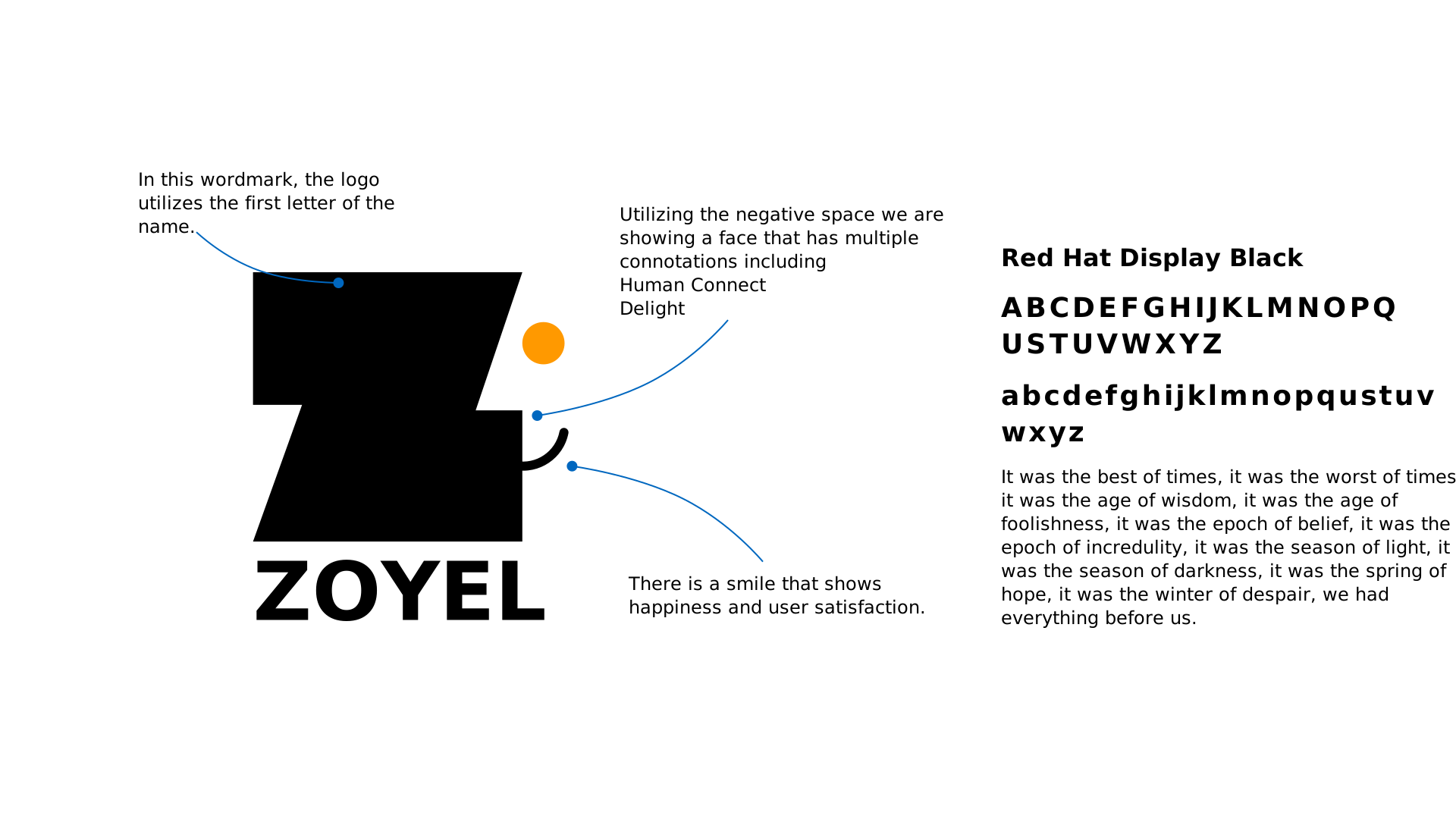
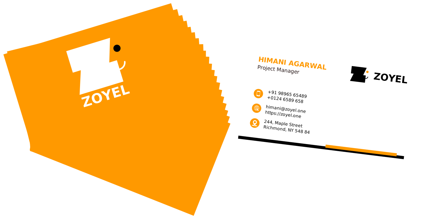
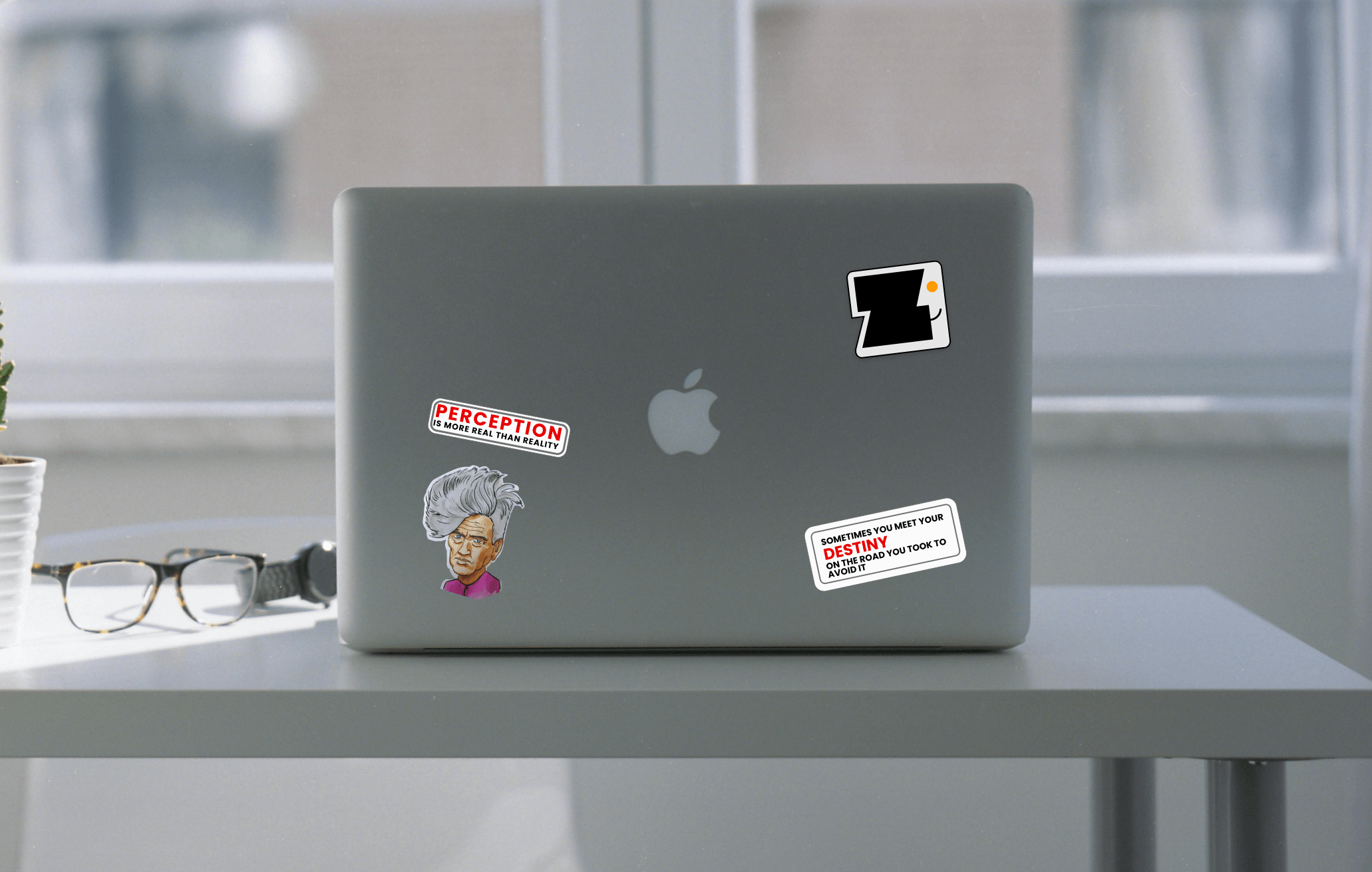
The final logo uses negative space to cleverly form a smiling face with the letter "Z," instantly giving the design a warm, approachable feel. I must admit, the inspiration for this concept came from the iconic Apple Finder icon, particularly the Happy Mac. The reflection of that iconic design is unmissable, yet it’s adapted here to suit the brand’s identity and purpose. The logo not only stands out but conveys a sense of friendliness and accessibility, perfectly aligned with the platform’s goals.