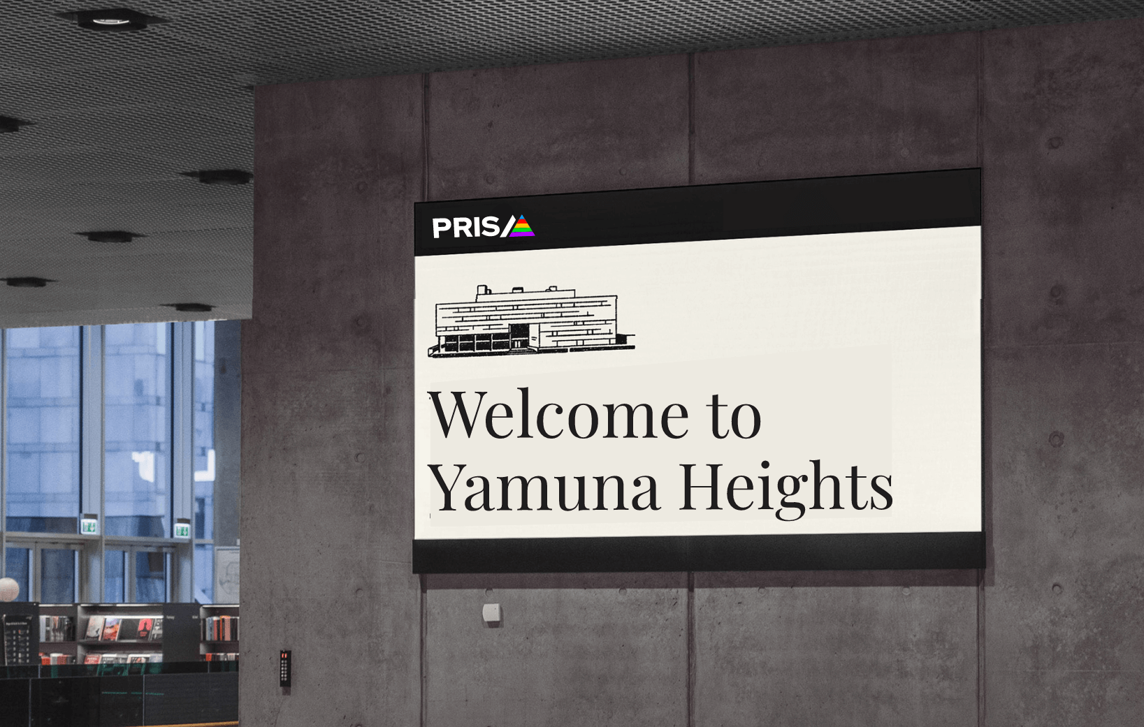
Clarity, Connection, and Transparency

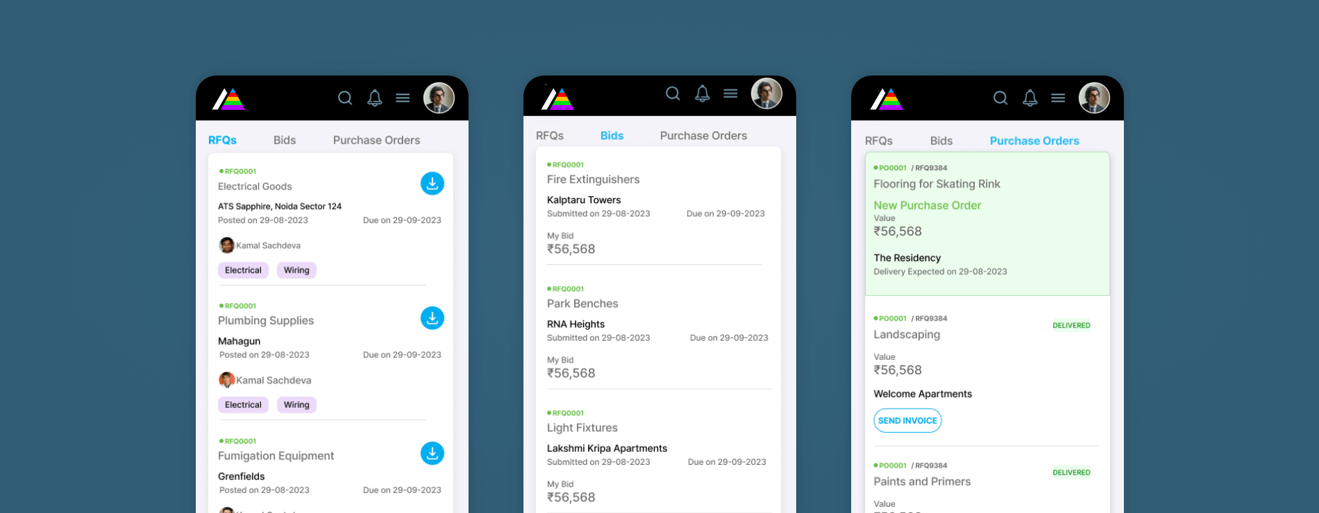
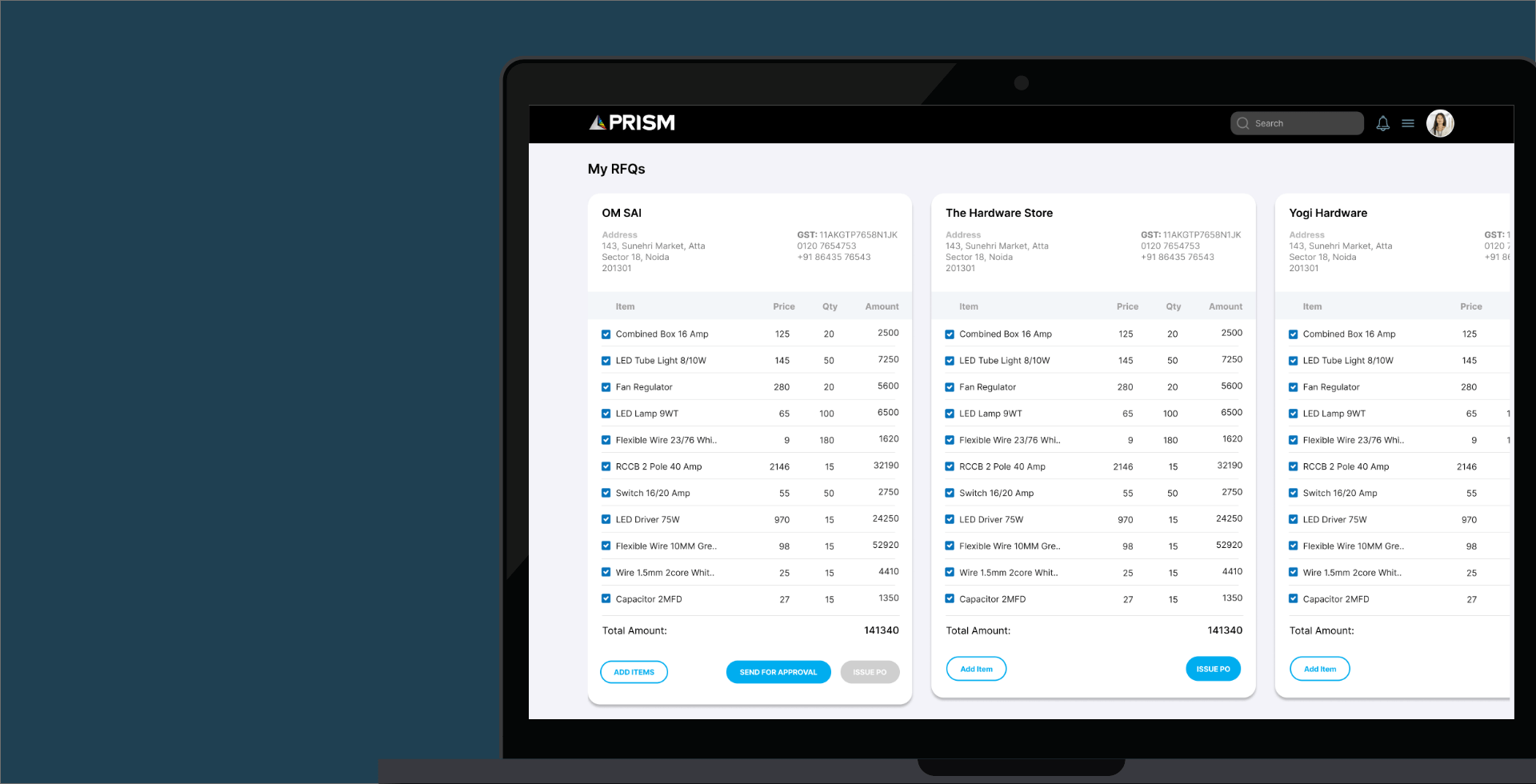
Prism connects housing societies with trusted vendors for electrical, plumbing, and sanitary products and services, streamlining the process for regular requirements. The company was founded with a vision to bring transparency to an otherwise opaque system, simplifying the work for everyone involved.

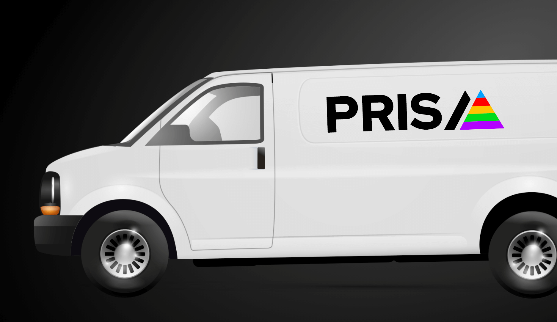
The logo draws inspiration from an actual prism, which splits light into a spectrum. Similarly, this app unites previously disconnected people and tasks into a single, cohesive platform. The logo reflects this idea of connection and integration, embodying the company’s mission to bring clarity and collaboration.
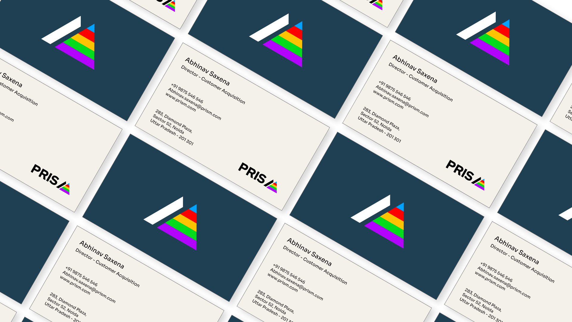
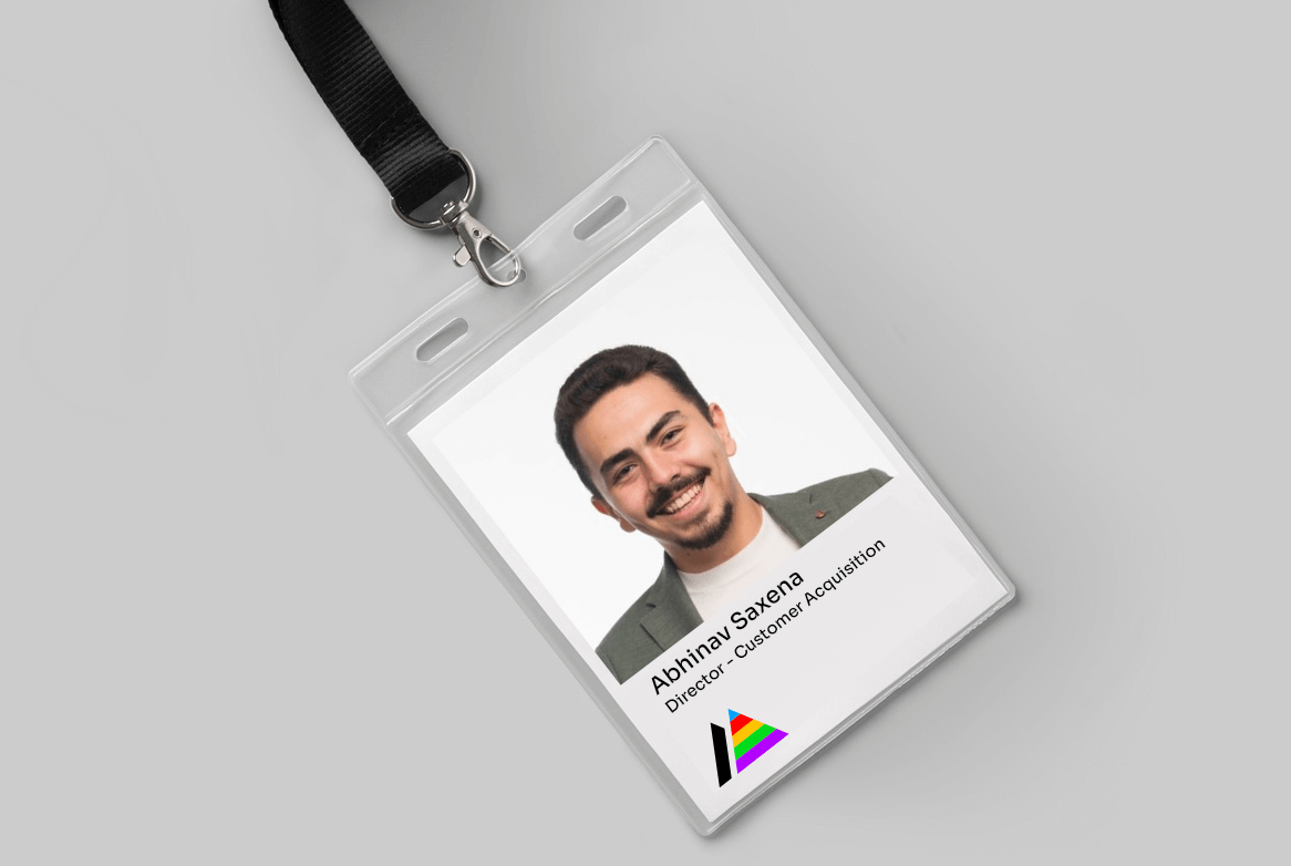
Brand Colour and Typography
Skyline Logo

Bringing clarity and connection, the Prism logo unites tasks, people, and transparency.

Brand Colour and Typography
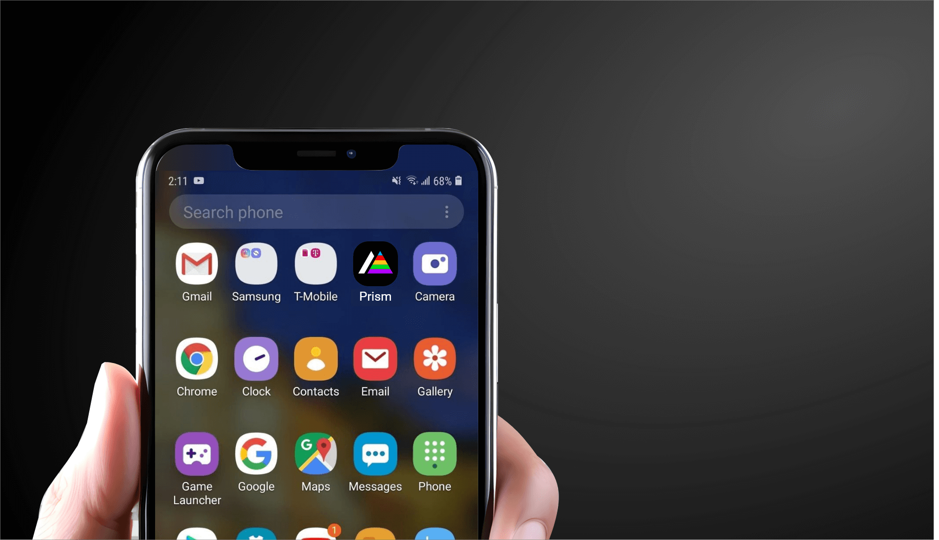
Prism App Icons
Skyline Logo
Skyline Logo
Previous Project

A Logo That Speaks Ownership

The logo sets the brand apart and resonates with users who may have felt excluded from real estate market due to high entry costs.

Next Project

Friendly, approachable and versatile

A logo with negative space that brings subtlety and creativity and creates a friendly symbol that users would associate with ease and friendliness.

Good design is actually a lot harder to notice than poor design because it fits our needs so well that it is invisible