

The key message behind our branding was simple yet powerful—partial ownership. Rather than focusing on financial returns or traditional investment narratives, we wanted to emphasize the unique value of allowing individuals to own a piece of something bigger—commercial property. This core message was designed to set us apart and resonate with users who may have felt excluded from this market due to high entry costs.
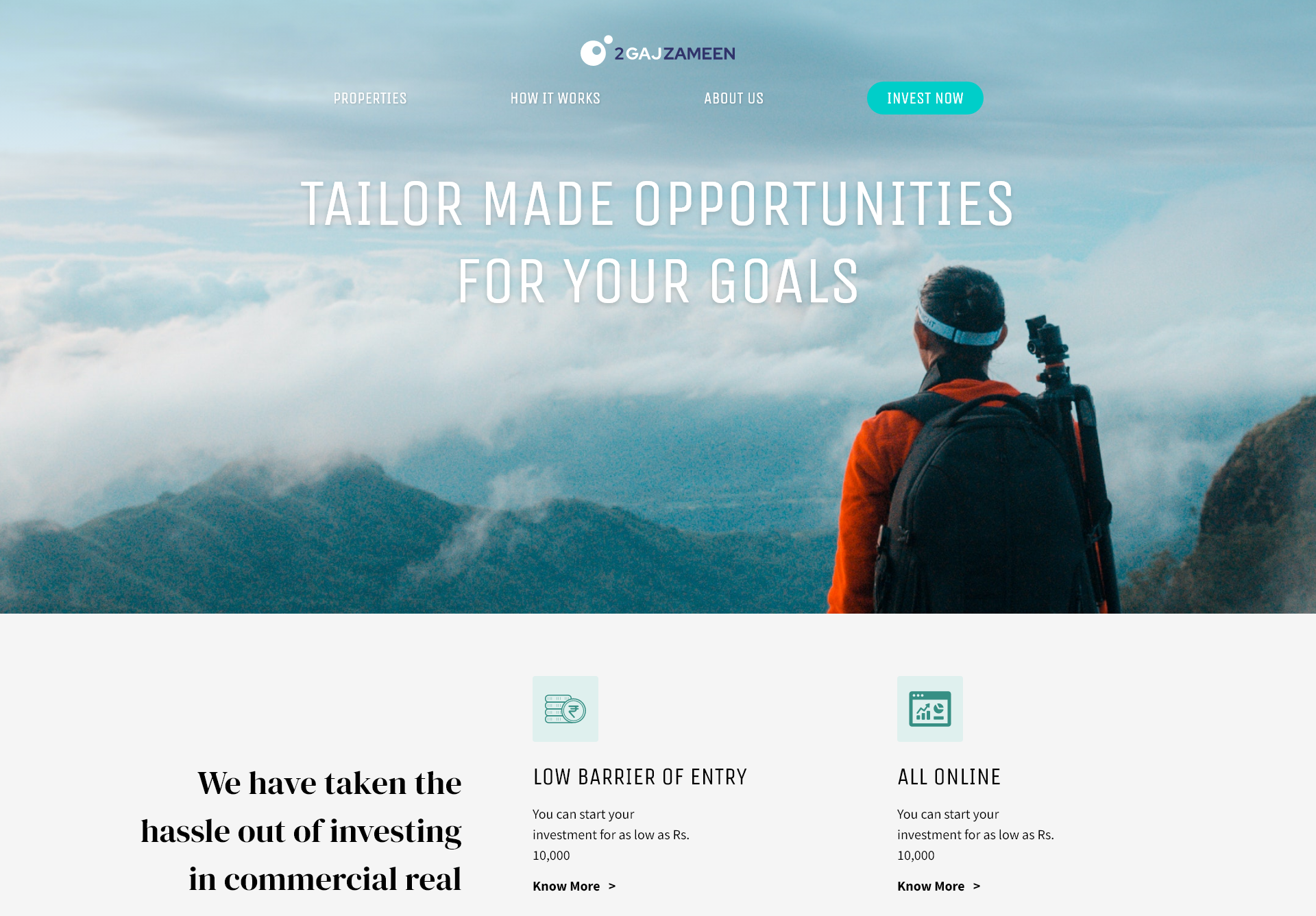
Our approach to the logo was guided by two principles: simplicity and recognizability. The logo needed to be clear and distinguishable, even at small sizes or in poor resolution, ensuring that it would stand out across various platforms and devices. The imagery was crafted to evoke a sense of opportunity—
This metaphor of ownership and possibility was central to the brand’s identity, creating an emotional connection and a sense of empowerment for users. The logo serves as a visual reminder that they are part of something significant, no matter how small their initial investment.
When designing the logo, we explored multiple concepts to reflect the core essence of the brand. The idea of partial ownership was central to our design approach, symbolizing how our customers can own a piece of something larger. We wanted the logo to visually communicate this sense of shared ownership, making it immediately recognizable and meaningful.

Another concept we considered was the significance of the number 2, a nod to the idea of duality—two parties involved in the transaction, or the 2 from the 2 Gaj Zameen. This subtle incorporation of the number created a sense of partnership and collaboration between the platform and its users.

Finally, we explored the measurement aspect derived from the name, symbolizing precision, control, and the careful management of investments. This idea was represented in clean lines and balanced proportions, conveying a sense of reliability and trust.
These concepts came together to form a cohesive logo that reflects the brand’s unique value propositions—ownership, partnership, and precision.
The final logo design was a simple yet powerful visual metaphor. It featured two circles: a large one representing the world or the commercial real estate market, and a smaller one that fit perfectly into a hole of the same size within the large circle. The idea behind this design was to convey the concept of partial ownership—the larger circle symbolizing the broader real estate market or a specific project, and the smaller circle representing the part owned by our customer.
This design visually communicates the essence of our platform: that every customer has a tangible piece of something much larger, reinforcing the brand's focus on ownership and inclusion in the commercial real estate space.


