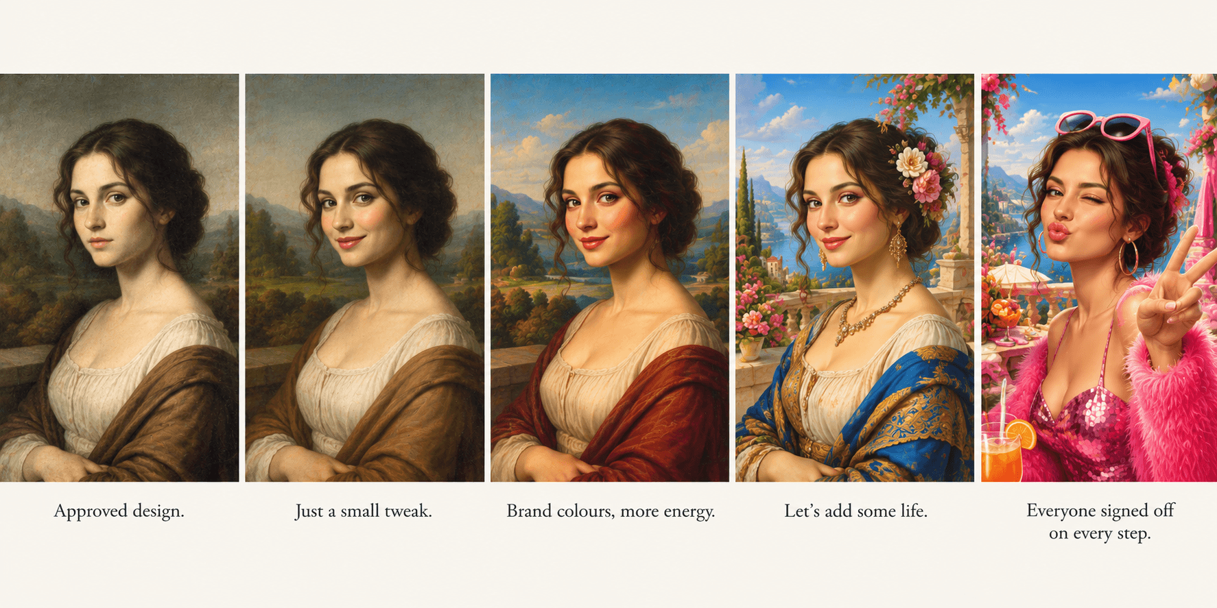
We rarely notice the gradual changes that eventually transform something we know well into something quite different. We notice the individual changes, perhaps, but not what they are collectively turning into. By the time we recognise the difference, the original may be almost unrecognisable.
This is creeping normality. To understand how it affects the work of UX designers, let's look at three questions: what we see, why it happens, and why it continues.
1A. What is creeping normality?
Creeping normality is when things change around you so slowly, in tiny increments and eventually become something you barely recognise. Each change is so small that you hardly notice it. You realise much later that the thing you knew is no longer what it used to be.
Consider Adobe's creative software. Many designers began using Photoshop as a product they could buy with a licence and continue using. Over time, Adobe introduced subscription-based access, changing the relationship between the user and the software. For users who prefer to own their tools outright, this was a significant shift.
Frustration has also grown among some users over subscription management and cancellation experiences. As alternatives have emerged, products such as Affinity have attracted attention from designers looking for different ways to work. New alternatives to established creative tools can generate considerable enthusiasm, particularly among people dissatisfied with aspects of the existing offerings.
These developments are not all the same kind of change, nor does every user experience them in the same way. But they illustrate how a product's evolution can gradually alter people's relationship with something they once relied on.
The important point is that we tend to judge each development on its own. It is only when we step back that we recognise how much the overall experience, and our relationship with it, has changed.
1B. What does creeping normality look like in UX design?
The work we do as UX designers can undergo similar changes. Just as a product evolves through successive decisions, the experiences we design can gradually become something quite different from what we originally intended.
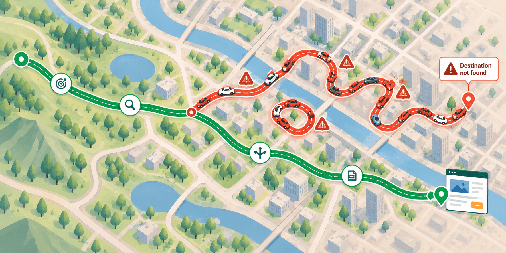
Imagine a landing page designed around a simple objective. It explains a product, establishes why it matters, and gives visitors one clear action to take. The headline, content, visual hierarchy and call to action work together. Nothing is accidental.
Marketing asks for another CTA because some visitors aren't ready to buy. Sales wants a third option for people who would prefer a demonstration. Someone suggests replacing the hamburger menu with persistent navigation. Then comes a campaign banner, followed by a video section.
Every request has a rationale. The page still works. Yet the visitor who once had a clear next step now faces competing actions. The original message has less room to establish itself, and the visual hierarchy becomes less obvious. The page contains more, but the experience communicates less clearly.
We tend to underestimate these changes because each one looks insignificant against the existing design. But elements don't operate independently. A new CTA competes with the existing one. A banner draws attention away from the headline. A new navigation bar changes the balance of the page.
A drop in the ocean looks insignificant. But drop after drop, the ocean itself changes.
The problem is not that the product has evolved. It is that its original intent has gradually been obscured by the accumulation of decisions. Nobody explicitly chose the final experience. It emerged from a sequence of individual choices.
2. Why it happens: We see the changes, not the cumulative effect
When a new request arrives, teams tend to evaluate it in isolation. Can we fit another CTA? Can we accommodate the banner? Can we make room for the video? The immediate question is how to implement the change, not how it will affect the experience as a whole.
Reconsidering the entire page takes time. There are deadlines, budgets and competing priorities. So the designer adjusts the layout, makes room and moves on. The next request arrives, and the process repeats.
Each new version becomes the baseline for the next decision. The distance between the original experience and the current one grows, while the individual steps seem too small to justify concern. Eventually, the team may no longer remember why the original design decisions mattered in the first place.
There is an important difference between adding something to a page and integrating it into an experience. Adding is an implementation task. Integrating requires us to reconsider how the new element affects what already exists.
Creeping normality takes hold when nobody consistently considers those relationships. The team keeps making changes, but nobody takes responsibility for the cumulative effect.
3. Why it continues: When people stop speaking up
There is another reason the problem persists: what happens to the people who notice it?
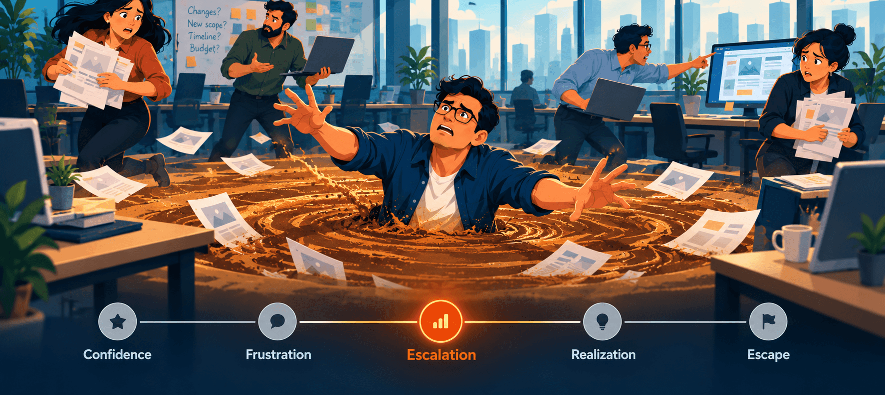
A designer who remembers the original intent may raise concerns. They can see the hierarchy weakening and the user journey becoming less coherent. Yet what they see as protecting the product may be interpreted as resisting business needs, slowing things down or being difficult to work with.
Labels have a way of sticking. Designers may find themselves excluded from discussions, consulted less often or overlooked for opportunities. They face a choice that shouldn't have to exist: continue challenging decisions and risk how they are perceived, or stay quiet and implement what has been requested.
Some continue to push back. Others learn to choose their battles. And some eventually stop raising concerns altogether.
This is the more troubling consequence. The organization may gradually lose not only the integrity of the design, but also the willingness of the people who understand it to defend it. The designer still does the work. The changes still get made. Everything appears to be functioning as it should.
When people stop raising concerns because of the personal cost, the organization loses an important source of feedback. The deterioration continues, not necessarily because nobody can see it, but because fewer people are willing to point it out.
This isn't an argument for blaming stakeholders. Business needs are real, and products must evolve. Nor is every disagreement evidence that a designer is right. The problem is when legitimate professional concerns are dismissed without considering their merits, simply because they challenge a decision someone wants to make.
How to interrupt it: Make the trade-offs explicit
The answer isn't to resist every request or redesign an entire page whenever something changes. Products must evolve, and business priorities are legitimate. The goal is to make the consequences of meaningful changes visible before they become part of the experience.
Return to our landing page. The team wants to add another CTA. Instead of immediately deciding where to put it, the conversation changes.
- What purpose does this serve? What user or business need are we addressing?
- What does it disrupt or displace? How might it affect the existing hierarchy, the user's journey or the primary action?
- Having understood the trade-off, do we still want to proceed? Is the expected benefit worth the impact, and can we integrate the change more thoughtfully?
These questions won't guarantee that every decision will be right. The business may still choose to prioritise a campaign over the original hierarchy. But the compromise becomes conscious rather than accidental.
This requires both a design process that considers the cumulative impact of changes and an organizational culture that takes professional concerns seriously. Designers must be able to explain the consequences of a decision without every disagreement being interpreted as resistance. Stakeholders, in turn, must be willing to consider what their requests change beyond the element being added.
The level of scrutiny should be proportionate to the potential impact. Not every small adjustment needs a full design review. But changes that affect the user's journey, visual hierarchy or primary objective deserve more than a quick decision about where to fit another element.
Good experiences are not preserved by preventing them from evolving. They are preserved by making sure we understand what each meaningful change gives us—and what it might cost us.
The next time someone asks for something new on a page that already works, the most useful question may not be where it should go. It may be what the addition changes, what it displaces, and whether that trade-off is worth making.
Because a good experience rarely loses its integrity in one dramatic decision. It happens one reasonable request at a time, until the result becomes something nobody originally intended to create.