Every generation of technology believes it is living through unprecedented change.
The desktop changed everything. The web changed everything. Mobile changed everything. Cloud computing changed everything. AI is changing everything.
And to be fair, each of these technologies has fundamentally changed the way we build software and the way people interact with it.
Yet after more than twenty-five years of designing products across several technology waves, I have come to a different conclusion.
Good design isn't about today's technology. It's about timeless human needs expressed through today's technology.
That thought came back to me recently while revisiting Jakob Nielsen's ten usability heuristics.
The heuristics were introduced in the mid-1990s, when most of us interacted with computers through desktop monitors, keyboards and a mouse. Looking at today's world, it would be easy to assume that these heuristics belong to another era.
I believe the opposite. Not because technology hasn't changed. It clearly has.
But because Nielsen's heuristics were never really about technology. They were about people.
The More Things Change, the More They Remain the Same
As kids we would play outside every evening, and some evenings we won't play, we would watch - The knives sharpner on his bike, the man repairing cane chairs and woven beds, the man coating brass pots and pans with "kalai", the man spraying the open drains to control mosquitoes.
We would quietly gather around them because we enjoyed watching skilled people do what they did best. We still do, but a little differtently. We watch blacksmiths forging knives, mechanics restoring forgotten cars, furniture makers rebuilding antique cabinets and craftsmen repairing old machinery on YouTube and streaming platforms.
The medium has changed.The curiosity has not.
Human needs tend to remain remarkably stable. The ways we satisfy those needs change constantly.
We hunted and gathered, we farmed.We preserved food. We industrialised food production. Today we have meal replacement shakes, personalised nutrition plans and food delivery apps.
Almost everything about what we eat has changed. The biological need for nutrition has not.
Transportation tells the same story. From wqalking to cars and flying in plains. How we travel has changed, the need to travel has not.
The medium evolves. The human need to communicate remains constant.
User experience follows exactly the same pattern.
Needs are enduring. Solutions are temporary.
We often mistake today's solution for tomorrow's principle. History repeatedly reminds us that they are not the same thing.
What Actually Changed?
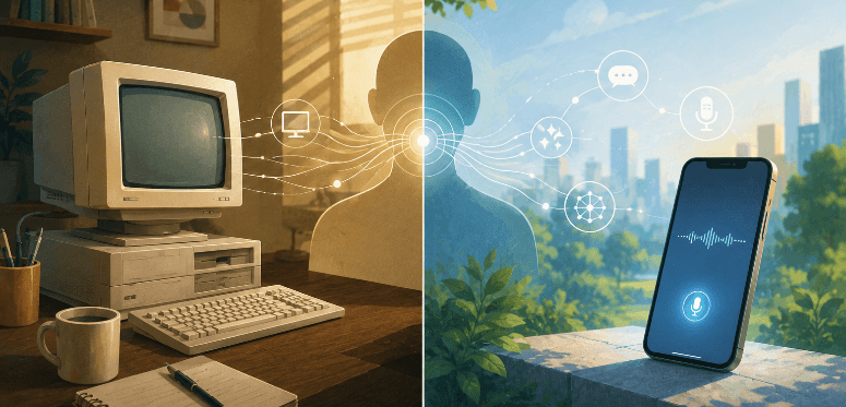
Thirty years ago, using software meant sitting in front of a desktop computer.
Today, I talk to an AI assistant while taking an evening walk.
I might begin a conversation on my phone, continue it later on my laptop and review it again on another device. Sometimes I type. Sometimes I speak. Sometimes I simply ask a question instead of searching for information.
The interaction has become conversational rather than navigational. Continuous rather than occasional. Available almost everywhere instead of only at a desk.
Technology changed, our needs didn't.
Users still want to understand what the system is doing. They still want to feel in control. They still want consistency. They still want software that prevents mistakes instead of creating them. They still want to accomplish their goals with the least possible effort.
The interaction model changed. The expectations did not.
Why Nielsen's Heuristics Have Lasted
People often ask whether Jakob Nielsen's heuristics are still relevant in the age of AI.
I think that question misses something important.
A better question is this:
Why have they remained relevant despite every major technological revolution over the last thirty years?
I believe the answer lies in how they were created.
When I think about Nielsen's heuristics, I don't imagine someone documenting interface patterns that happened to work in the 1990s. I imagine someone repeatedly asking a much deeper question.
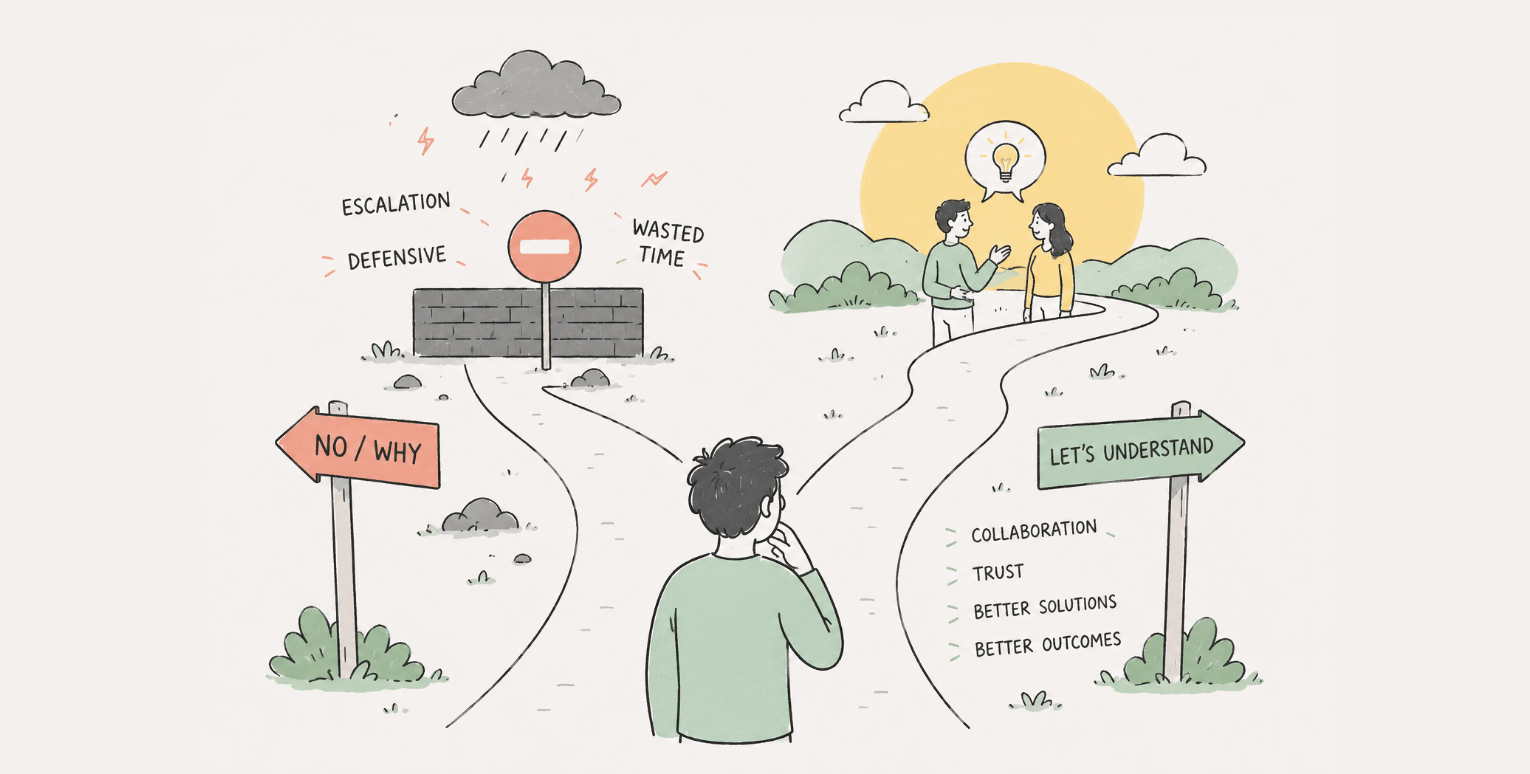
Why?
Why should users receive feedback? Why should they remain in control? Why should interfaces reduce memory load? Why should systems prevent errors?
If you keep asking "why," eventually you stop talking about interfaces altogether. You begin talking about uncertainty. Confidence. Control. Trust. Attention. Human limitations.
Those are not characteristics of desktop software. They are characteristics of people.
And that, I believe, explains why these heuristics continue to feel surprisingly modern.
When Principles Outlive Their Original Context
One of the biggest mistakes we make as designers is confusing an implementation with the principle behind it.
Every few years, a new framework appears that promises to simplify frontend development. Every generation believes it has found a better approach. Eventually another framework replaces it, and the cycle begins again.
What survives isn't the framework. It's the underlying principle.
The same is true for usability.
When people say Nielsen's heuristics are outdated, they are often looking at the implementation rather than the principle.
A progress bar is not the heuristic. A keyboard shortcut is not the heuristic. A menu is not the heuristic.
Those are merely expressions of deeper ideas. Once we separate the two, the heuristics become remarkably resilient.
Visibility of System Status Is Really About Human Control
Perhaps no heuristic demonstrates this better than Visibility of System Status.
When most designers think about this heuristic, they immediately think of progress bars, loading indicators, spinning icons or messages that say "Processing..."
Those are implementations.
The real question is:
Why does the user need to know what the system is doing?
My answer is simple.
Because visibility gives people a sense of control.
Whenever we lose visibility, we begin losing confidence. We start wondering whether something has failed. We click buttons multiple times. We refresh pages. We become impatient.
The interface isn't the problem. Uncertainty is.
That was true when we waited for desktop applications to save files. It was true when websites loaded slowly over dial-up connections. It is equally true when an AI assistant pauses for several seconds before responding.
The technology has changed. The human response has not.
Visibility of system status isn't really about showing progress. It's about reducing uncertainty.
Once viewed from that perspective, the heuristic suddenly feels timeless.
User Control Exists Because Real Life Is Messy
Another heuristic that becomes more meaningful with experience is User Control and Freedom.
When many designers first encounter this principle, they think of Undo buttons, Cancel actions and Back links. Those are useful examples, but they are not the principle itself.
The real principle is acknowledging that people rarely follow perfectly linear processes.
I learned this lesson while working on a procurement platform called Prism.
At first glance, procurement appeared to be a straightforward workflow. A request is created. Vendors submit quotations. One quotation is selected. A purchase order is generated.
Reality turned out to be considerably more complex.
A single procurement request could generate seven or eight quotations. Many of those quotations covered only part of the requested items. Users compared prices across multiple vendors before deciding which supplier should provide each individual product. One procurement exercise could ultimately result in several purchase orders, each going to a different vendor.
The software initially reflected how we imagined procurement should work. The users showed us how procurement actually worked.
That changed the design completely.
Instead of forcing users into a clean, sequential workflow, we redesigned the product to accommodate the flexibility they needed in real life.
In hindsight, we weren't merely applying Nielsen's heuristics. We were discovering why they exist.
Good software adapts to the way people work. It should never force people to work the way the software expects.
That lesson extends far beyond procurement systems. Whether we are designing enterprise software, consumer applications or AI assistants, users inevitably surprise us. Their workflows are rarely as neat as our diagrams.
The more experience I gained, the less I believed in designing ideal processes. Instead, I learned to understand existing behaviour before trying to improve it.
Matching the Real World Is Still One of the Hardest Problems
Closely related to user control is another heuristic that quietly underpins almost every successful product: Match Between the System and the Real World.
This heuristic sounds almost obvious until you begin designing software for specialised industries.
Every domain has its own vocabulary. Its own mental models. Its own shortcuts. Its own assumptions.
Healthcare professionals think differently from lawyers. Lawyers think differently from procurement officers. Procurement officers think differently from teachers.
Designers sometimes assume that users should adapt to software because software is logical. In practice, successful products do the opposite.
They respect the language, behaviour and expectations people already possess.
This is one of the biggest reasons why copying another product rarely works.
Two applications may appear similar on the surface while solving fundamentally different problems for entirely different users.
Experience teaches you not to reuse solutions blindly. It teaches you what needs validating.
That may be one of the most valuable lessons I have learned over the past twenty-five years.
Every client is different. Every project is different. Every group of users is different.
The similarities often attract our attention. The differences determine whether a design succeeds.
Flexibility and Efficiency Mean Something Different Today
Among Nielsen's ten heuristics, Flexibility and Efficiency of Use has probably undergone the greatest transformation in its implementation.
When Nielsen described this principle, desktop computing was the dominant interaction model. Efficiency often meant keyboard shortcuts, accelerators and faster ways for experienced users to complete repetitive tasks.
Those ideas are still relevant. They are simply no longer sufficient.
Today's users move effortlessly between devices throughout the day. They type. They tap. They swipe. They dictate. Increasingly, they describe what they want instead of navigating towards it.
The interaction has become conversational. That is a profound technological shift. But notice what has not changed.
Users still want the quickest path to accomplishing their goal. They still appreciate software that adapts to their level of expertise. They still expect repetitive work to become easier over time.
Efficiency no longer depends on mastering an interface. Increasingly, it depends on the interface understanding the user.
That is a different implementation of exactly the same principle.
Minimalism Is No Longer About Aesthetics
One heuristic surprised me more than any other while reflecting on this article.
When Jakob Nielsen spoke about Aesthetic and Minimalist Design, he was cautioning designers against unnecessary ornamentation. Every visual element that did not contribute to the user's goal created additional cognitive load.
That was sound advice then. It is even more relevant today.
Interestingly, the reason has changed.
In the early days of the web, visual design often competed for attention. Designers experimented with gradients, textures, animations and decorative elements because technology suddenly made those things possible.
Today, look at the interfaces millions of people spend hours using every day.
Open ChatGPT. Open Claude.
Notice how little there is.
The logos are understated. Colours are used sparingly. Navigation remains intentionally unobtrusive. Most of the screen is dedicated to one thing: the conversation.
Some might describe these interfaces as minimalist. I think something even more interesting has happened.
The conversation has become the primary interface. That does not make Nielsen's heuristic less relevant. It makes it easier to appreciate.
Minimalism is no longer simply a visual style. It is a conscious decision to remove everything that competes with the user's intention.
The purpose of an interface is not to be noticed. It is to help users achieve what they came to do.
When the interface succeeds, attention shifts naturally towards the task instead of the software. That has always been the goal of good usability.
Heuristics Are Guides, Not Checklists
One misunderstanding I've observed over the years is how usability heuristics are applied.
Many teams treat them as a checklist.
Someone points to a screen and says, "We've followed Nielsen's heuristic here." Another screen satisfies another heuristic. Eventually every principle has been "covered."
I don't believe that was ever Nielsen's intention.
A heuristic is not evidence that a design decision is correct. It is a way of thinking about whether a design decision serves people well.
The distinction is important.
Good design does not emerge because someone successfully ticks ten boxes. It emerges because designers understand the human need each heuristic is trying to address.
Once that need is understood, the implementation becomes far less important.
This is also why experience matters.
Experience does not give designers a library of solutions that can be copied from one project to another. If anything, it teaches the opposite lesson.
Experience doesn't eliminate the need for validation. It increases it.
Every client is different. Every organisation has different constraints. Every group of users has different behaviours, expectations and mental models.
Two products solving similar business problems can require completely different solutions because the people using them are different.
That is why experienced designers continue conducting research instead of relying solely on past successes. Experience teaches us what to question. Not what to assume.
The Difference Between Trends and Principles
Looking back over the past three decades, I have seen countless technologies, methodologies and frameworks emerge. Some transformed the industry. Others disappeared almost as quickly as they arrived.
The internet becoming mobile fundamentally changed how people accessed information. Web 2.0 transformed users from passive consumers into active creators. Artificial Intelligence has changed how we communicate with computers by making conversation a primary mode of interaction.
Those are genuine shifts.
But even these revolutions did not change the underlying reasons people use software.
People still seek clarity. They still want confidence. They still need control. They still appreciate consistency. They still make mistakes. They still become frustrated when systems fail to communicate.
Good design begins by recognising which aspects of our work are temporary and which are enduring.
The tools will continue changing. The devices will continue shrinking, expanding or perhaps disappearing altogether. Interaction models will evolve. Artificial Intelligence will become more capable.
The principles guiding good design should be much slower to change. Otherwise, they were probably never principles to begin with.
Why This Matters
There is a tendency in our industry to assume that every technological breakthrough demands an entirely new set of design rules. while new technologies do require us to rethink implementation, they rarely require us to rethink human nature. Whenever I evaluate a new technology, I now find myself asking a different question.
Not: "What new rule does this technology require?"
But: "What enduring human need is this technology helping people satisfy?"
That question almost always leads me back to ideas that have existed for decades.
The interface changes. The need remains.
The implementation changes. The principle remains.
The solution changes. The human need remains.
That, I believe, is why Jakob Nielsen's heuristics continue to matter after thirty years. Not because they captured the interfaces of the 1990s. But because they captured something much deeper.
They captured people.
Conclusion
At the beginning of this article, I spoke about watching craftsmen in my neighbourhood. Today, we watch people with similar skills through entirely different media. The setting changed. The fascination did not.
That simple observation has stayed with me for years because it reflects a broader truth.
Needs are enduring. Solutions are temporary.
The same pattern appears everywhere.
We have always needed nourishment, although what we eat has changed dramatically.
We have always needed transportation, although the vehicles have changed beyond recognition.
We have always needed communication, although the technologies have evolved from handwritten letters to conversational AI.
User experience is no different.
The desktop gave way to the web. The web gave way to mobile. Mobile has given way to conversational interfaces powered by AI. Tomorrow will introduce another paradigm that feels equally revolutionary.
When that happens, I hope we resist the temptation to discard enduring principles simply because the technology has changed.
Instead, we should ask a simpler question.
What human need remains unchanged?
The answer to that question will usually tell us far more than the latest technology ever can.
Good design isn't about today's technology. It's about timeless human needs expressed through today's technology.
That, perhaps, is the real reason Jakob Nielsen's heuristics have remained relevant for over three decades. Not because they belong to the past. But because they continue to describe the people we design for.