
What makes a design good?
A good design helps people accomplish what they came to do. It makes the important things understandable, helps users make the right decisions, and removes unnecessary effort without hiding information they actually need. It also has to work within the realities of the business, technology and context in which it exists.
That means good design is not necessarily the most beautiful design, the most minimal design or the one with the fewest elements. A design can be visually impressive and still make a task harder. It can be minimal and still leave users wondering what to do next. The measure of good design is not how much attention the design attracts, but how well it helps the user achieve the intended outcome.
Once that becomes the objective, simplicity takes on a different meaning. The question is no longer how little can be put on the screen. It becomes a much harder question: what actually needs to be there?
Are You Designing For Your Users or Yourself?
You are interested in making things that are clever. You want the design to look good, feel distinctive and, if possible, make people notice the design itself. When you are learning design, it is easy to see the work as an expression of your ability.
Over time, that focus can change. Instead of asking, “How can I make this more interesting?”, you start asking, “How can I make this easier for the person using it?” It sounds like a small change in wording, but it can fundamentally change the decisions that get made.
You start noticing how many things that once felt like good design are actually ornamental. A large heading because it looks impressive. A typeface chosen because it has character. A visual element added because the composition seems to need something. A divider because it makes the layout feel more structured. None of these decisions is necessarily wrong, but each one needs a reason to exist.
This distinction becomes particularly important in enterprise applications. A promotional website can benefit from visual expression that creates a mood or communicates a brand. An enterprise application has a different job. Someone is usually there to complete a task, find information, understand a situation or make a decision. Anything that gets in the way of that objective needs to justify its presence.
Every element has to earn its place in the design.
Simple does not mean minimal
Once you understand the purpose of your design, you become much more willing to remove things. But that does not mean removing as much as possible. Minimalism, by itself, is not a design objective.
A label can look unnecessary but prevent an error. An explanation can add visual weight but eliminate uncertainty. A little more information can sometimes make a task dramatically easier. The question is not whether something makes the screen busier. The question is whether it helps the user achieve the objective.
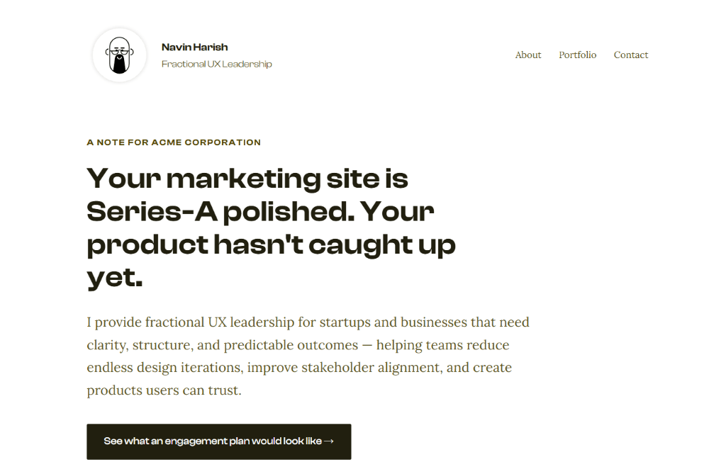
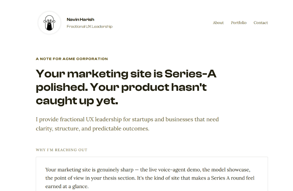
Consider a landing page with a call to action and a divider after the introduction, where the introduction itself is longer than it needs to be. Together, these elements can push an important section below the fold. Removing them may make the page look less elaborate, but it can allow the user to see something more important immediately.
The same principle applies to spacing and typography. A wide layout with a narrow text block and generous spacing can be visually appealing, but that does not automatically make it better for reading or communication. An eyebrow may add visual hierarchy, but if it does not add useful information, it may not deserve the space it occupies.
These are not rules about landing pages. They are decisions about purpose. Every visual treatment has to justify the space and attention it consumes.
The paradox of simple design
This is where people often underestimate the work involved in good design.
When a screen contains many elements, the designer has many visible decisions to make. Where should this card go? How should these controls align? How should these sections fit together? What should be the spacing between them?
When a screen contains only the essential elements, there are fewer visible decisions. But that does not mean there were fewer design decisions.
The designer has had to decide what is essential. What can be removed? What should be prominent? What can be secondary? What information does the user need at this point? What can be deferred? What happens in less common situations? Which requirements actually matter? Which ones are simply requests that nobody has questioned yet?
The fewer decisions a user sees, the more decisions the designer may have had to make.
That is why simple design can be harder to make than complicated design. The complexity has not disappeared. Much of it has been absorbed before the user sees the interface.
What happens when nobody makes those decisions
I am currently working on a dashboard that makes this particularly clear. The original version had a very large number of metrics and sections. It was easy to understand how it got there. Different people wanted different pieces of information, and most suggestions were accepted without much resistance.
There is nothing obviously unreasonable about any individual metric. The problem appears when you look at the whole system. If every piece of information is important to someone, the dashboard can eventually become a place where everything competes for attention.
My version contains considerably less information on the surface. That can create the immediate impression that I have simply removed a lot of data or made less effort. But the reduction was not the work. The work was deciding what needed to remain, what could be removed, how related information should be grouped, what should be easier to scan, and what order would make sense to someone trying to understand the situation.
The objective was not to make the dashboard look cleaner. It was to make it easier for someone to make an informed decision.
That is a very different starting point.
The first question is not “What information can we show?” It is “What does the person using this need to understand or decide?” Once that is clear, the information and hierarchy become easier to evaluate.
Good design does not necessarily mean less information. It means less unnecessary competition between pieces of information.
Sometimes simplicity is a stakeholder problem
There is another reason simple design is difficult: the designer is not the only person making decisions about the interface.
I have encountered situations where an element had little functional value but was still expected to remain because of stakeholder priorities. In one government project, for example, I argued against keeping photographs of senior political figures on an interface because they served no useful purpose for the user. I was not able to remove them.
That experience is worth remembering because it prevents a simplistic view of design leadership. Knowing that something is unnecessary does not mean you will always be able to remove it. Sometimes the desire to satisfy people with influence is stronger than the desire to achieve the best possible user experience.
Pick Your Battles Carefully
Earlier in my career, I would have approached situations like this much more directly. I might have said that something was wrong and argued that it should not be done. That often turned the discussion into a battle of wills.
I have become much less abrasive with experience. I listen first. I try to understand why someone wants something. Then I try to understand whether the underlying objective can be met in a better way.
A good example was a client who wanted a human figure incorporated into a logo. I did not immediately argue against the brief. Instead, I explored the reasoning behind the request and created an alternative. When I presented it, I first showed how common human-figure logos had become and how easily another logo of the same kind could disappear into a sea of similar identities. Once the problem was understood, the alternative became much easier to accept.
The lesson for me was not that designers should always win arguments. It was that telling someone “this is bad design” is usually less effective than helping them see the problem themselves.
The designer has to let go
There is also a personal difficulty in making simple design. You have to be willing to let go of things you like.
I deliberately try to disassociate myself from my designs. I don't want to look at something and think of it as something I am fond of. I try to look at it as someone encountering it for the first time and ask whether it makes sense.
I know that this does not make me objective. None of us can become completely objective about our own work. We all have our own preferences, assumptions and blind spots. I try to get as close to objectivity as I can without pretending that I will ever reach 100 percent.
That is also why I am more open to feedback from the right people than I was earlier in my career. The purpose of feedback is not simply to collect opinions. It is to expose the parts of my thinking that I may not be able to see myself.
Good design is not the result of having no opinions. It is the willingness to question your own opinions when they stop serving the user.
The work nobody sees
When people see a simple interface, they see the conclusion of the design process. They don't see the questions that were asked to arrive there.
They don't see the things that were removed. They don't see the alternatives that were considered. They don't see the arguments with stakeholders, the edge cases that were discussed, the information that was prioritised, or the decisions about what the user does not need to know.
They see a screen with fewer elements.
That can make the work look easy.
But simplicity is often the visible consequence of invisible decisions.
This is why I have become increasingly suspicious of the idea that design effort can be judged by the amount of visible output. A screen with twenty elements can require less thoughtful design than a screen with five. A clean dashboard can represent more design thinking than a crowded one. A seemingly obvious interaction can be the result of dozens of decisions that have been deliberately hidden from the user.
The goal is not to eliminate complexity from the world. That is rarely possible. The goal is to decide where that complexity should live.
If the user has to carry it, the interface may look simple while the experience remains difficult. If the designer absorbs it through research, prioritisation, hierarchy, iteration, testing, negotiation and judgement, the user may experience something that feels obvious.
That apparent obviousness is not evidence that little thought went into the design.
Often, it is evidence that a great deal of thought did.